DSLRs have many tools to assist in capturing amazing images. One of the easiest to use and most useful is histogram. After the image has been taken, a histogram of tonal range is displayed giving an immediate feedback on the quality of exposure. Understanding how to use this feedback can help to learn to understand light and master exposure in your photography.
But first things first, what is a histogram? Well, let's start with an example. Imagine you went to a fruit market, and here's what you bought.
But first things first, what is a histogram? Well, let's start with an example. Imagine you went to a fruit market, and here's what you bought.
 If you were to organize all the fruits and berries into a histogram it would look something like this:
So, just by looking at this graph, we already know that we have the most blackberries; peaches and limes are the ones that we have the least. Now, if for whatever reason you expected to buy lots of peaches and limes, but no blackberries, this chart will tell you that something went wrong. Right off the bet, you can go back and correct your mistake.
DSLRs do exactly the same thing. Histograms contain information on tone distribution throughout your image and the density of pixel distribution (in other words, count of color pixels, just like count of peaches and strawberries). So, if you see that your "count" is off, you can go back and correct your mistake by re-taking the photograph.
Using Histogram: How to read the Graph
Reading the histogram is easy. Horizontal axis tell you about the tone of the photograph. It goes from pitch black on the left (0) to brightest white (255) all the way on the right. As a tonal range scale it would look like this:
The vertical axis tell you about intensity of color in your photograph. The higher the peak, the more color you have. In the example above, blackberry had the highest peak because it had the highest count. Peaches and limes were present, however they had the lowest count. If this were an actual histogram, blackberry would represent colors that correspond to mid-gray shade range (mid-browns, blues, etc..); peaches would be dark shades and limes would be bright highlight tones. So, the histogram curve displays the color intensity. Tones with higher distribution will show as higher peaks. The lower the distribution, the lower the peak.
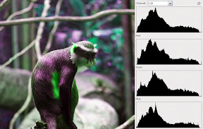
Let's take a look at the actual photograph and corresponding histogram. In the example below there are total of four charts. First one is RGB (Red, Green, Blue) histogram. It provides feedback on the overall (or combined) tonal range of the photograph. The 3 charts below (Red, Green and Blue respectively) provide feedback on each of the individual channels for more detailed information. These graphs can be useful because they may indicate that a channel has excessive "clipping" which may not be evident from RGB histogram.
The photo below has good exposure because we can see a nice curved shape. Darker and mid-tone shades dominate this composition, and that is reflected by a higher peak on the left side of the graph. However, lighter shades are also captured, as indicated by the graph, hence detail in those regions is preserved. Even, if this image is still too dark for the taste, during post processing lighter portions can be enhanced further because that information registered properly and retained in the photograph. Please note, that histogram will not tell you if your photo is of good aesthetic quality or contains a proper color balance. Just that your image has captured good information and brightness levels of shadows and highlights are nicely distributed.
DSLRs do exactly the same thing. Histograms contain information on tone distribution throughout your image and the density of pixel distribution (in other words, count of color pixels, just like count of peaches and strawberries). So, if you see that your "count" is off, you can go back and correct your mistake by re-taking the photograph.
Using Histogram: How to read the Graph
Reading the histogram is easy. Horizontal axis tell you about the tone of the photograph. It goes from pitch black on the left (0) to brightest white (255) all the way on the right. As a tonal range scale it would look like this:
0 255
255
255The vertical axis tell you about intensity of color in your photograph. The higher the peak, the more color you have. In the example above, blackberry had the highest peak because it had the highest count. Peaches and limes were present, however they had the lowest count. If this were an actual histogram, blackberry would represent colors that correspond to mid-gray shade range (mid-browns, blues, etc..); peaches would be dark shades and limes would be bright highlight tones. So, the histogram curve displays the color intensity. Tones with higher distribution will show as higher peaks. The lower the distribution, the lower the peak.
Let's take a look at the actual photograph and corresponding histogram. In the example below there are total of four charts. First one is RGB (Red, Green, Blue) histogram. It provides feedback on the overall (or combined) tonal range of the photograph. The 3 charts below (Red, Green and Blue respectively) provide feedback on each of the individual channels for more detailed information. These graphs can be useful because they may indicate that a channel has excessive "clipping" which may not be evident from RGB histogram.
The photo below has good exposure because we can see a nice curved shape. Darker and mid-tone shades dominate this composition, and that is reflected by a higher peak on the left side of the graph. However, lighter shades are also captured, as indicated by the graph, hence detail in those regions is preserved. Even, if this image is still too dark for the taste, during post processing lighter portions can be enhanced further because that information registered properly and retained in the photograph. Please note, that histogram will not tell you if your photo is of good aesthetic quality or contains a proper color balance. Just that your image has captured good information and brightness levels of shadows and highlights are nicely distributed.
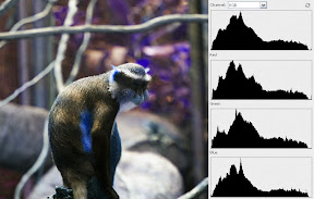
 Let's see what happens if we were to select a portion of the photograph from the original. Sample indicated by the red rectangle was used to collect the data in this histogram. There are clearly two steep peeks on each side forming a "valley" shape. This is bad because tones in those areas are very dark (on the left) and very bright (on the right). Information that usually falls in that tonal range contains no value. Very bright or very darkly exposed images lack definition and even with post processing image is unrecoverable. So, ideally, when looking at the histogram, most of the values should not be concentrated by the extreme edges of the graph.
 So, what histogram actually shows is the amount of shadow and highlights that have been captured by the camera sensor. Brightness and darkness levels determine proper exposure. It has absolutely nothing to do with hue of the color, just its intensity. For example, let's take a look at these three images. While color hue varies drastically, the tone stays in a same range, hence the histogram is identical for all three images
.
Using Histogram: Practical Application
This is an example of an underexposed image. Mid-range and high tones are almost not present in this image, however, dark tones are at the highest peak and dominate the image. What can you do to fix it? There are several approaches. If you cannot control the light, try to open up your aperture, decrease your shutter speed, raise ISO, obtain additional light by using a flash or use positive exposure compensation to obtain proper exposure.

This example shows a histogram of an over-exposed image. Most tones are very bright and histogram reflects that by dominating peak on the right-extreme side. To fix this, try stepping down your aperture settings, increase your shutter speed, lower ISO or use negative exposure compensation. If after adjustment results are still not enough, try using ND (Neutral Density) filter to reduce the amount of light entering the lens.

Trying to avoid peaks at the edges of the histogram is not always the goal. For example, if composition contains a strong light source (such as sunny window), histogram will reflect that with peaks on the far right. If shooting at night, far left side will contain a peak. So, in essence, it is a reference tool to check if the image captured contains the tonal range that you would expect. While histogram will not tell you if the image is "good," it will provide feedback of how much of the image has no usable information (located at the extreme ends of horizontal axis) and serves as a good exposure indicator.


No comments:
Post a Comment